case study
UX/UI Design for Anvesa's Processing Tool
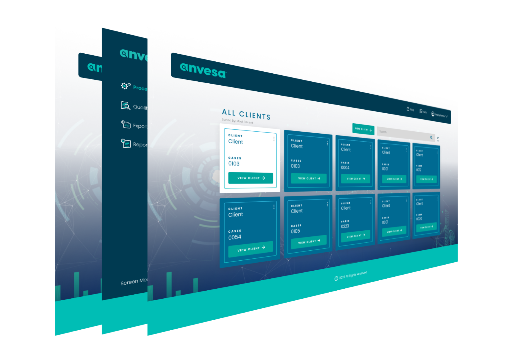
Project Overview
Anvesa developed an internal processing tool aimed at streamlining file processing and enhancing compatibility with e-discovery platforms and Earl Case Assessments. While initially designed for internal use, the leadership planned to offer it as a module within the company’s broader e-discovery platform. The challenge was the lack of initial information, limited access to end-users, and the absence of a consistent design system for cross-functional teams.
Challenges
User Access
Limited access to end-users for direct feedback and insights.
Limited Information
Initial information about user requirements and pain points was scarce.
Consistency
No existing design system for a unified approach to UI design.
Engaging Users
& Stakeholders
In creating our new internal processing tool, I made it a point to regularly meet with our team and the end-users every week. These meetings were recorded, which turned out to be super handy for referring back to discussions and making sure that team members who couldn’t make it were still in the loop. This helped us keep everyone on the same page and gather insights from both our internal folks and end-users. The recorded meetings became a go-to resource, making it easy to revisit and build upon the ideas that shaped the tool’s user experience.
Establishing a
Design System
I created a design system using Figma to keep things consistent and make teamwork smoother. Keeping things up-to-date, I regularly tweaked and maintained the design system to match the changing needs of the project. To help everyone work together seamlessly, I shared guidelines and documentation that made it easy for different teams to understand and use the design system effectively. This way, we ensured a unified and collaborative approach across the board.
Collaboration
With the Dev Team
I teamed up closely with the development crew, making sure our design ideas matched up with what they were building. We coordinated efforts, designing and quality-checking screens at the same time as the development work. To keep things running smoothly, we had regular catch-up meetings to stay in the loop about progress and sort out any issues that might be holding us back. This hands-on collaboration ensured a seamless connection between the design and development sides, making the whole process more efficient.
- Conducted usability tests on completed screens.
- Gathered feedback from JIRA and the QA team to identify and address issues promptly.
- The involvement of end-users in usability testing was considered for direct insights and validation.
Outcomes
The following step involved designing lo-fi mockups to organize all the information that should go on each page of the new website. The information architecture was based on a desktop-first approach and then adapted for tablet and mobile views.
- A comprehensive understanding of user needs and pain points
- A well-documented and updated design system for consistent UI development
- Collaboration between design and development teams streamlined the implementation process.
- Usability testing and feedback collection led to refined and user-friendly screens
- The project's iterative approach allowed for continuous improvement.
Conclusion
By addressing the initial challenges through a structured approach, we successfully developed an internal processing tool with a user-friendly and consistent UI. The implemented design system facilitated collaboration among cross-functional teams, ensuring the application’s seamless integration into the broader e-discovery platform. The iterative design process and user-centric approach resulted in a product that met both internal and end-user requirements effectively.
Get In Touch
I’m always available for a good chat. Get in touch and let’s talk! Also, feel free to reach out to me via LinkedIn.